Design
30 mins
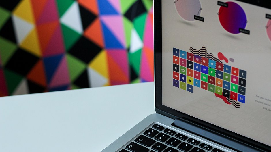
Visualise your data with the best charts and graphs
- Abstract:
- Charts and graphs are some of the easiest and best ways to visualise your data. They can help you turn complex datasets into easier to understand visuals that you can share in reports, on websites and on social media. This course will teach you how to choose the best chart and graph to fit your dataset and includes lots of tips and techniques.
- About this course:
- This course is designed for journalists and human rights defenders who are interested in data visualisation and are keen to learn new ways to display their data. Using the wrong type of chart or graph for your data can result in a misrepresentation of numbers and ultimately you’ll end up misleading your audience, which you never want to do! So this course will help you to effectively and correctly illustrate long-term trends, percentages or other comparisons, as well as show and compares changes, relationships, and ultimately make your numbers come to life.
- What do I learn:
- You’ll learn which charts and graphs are the best to use for different types of data sets and situations, as well as how to draw them using Google spreadsheets. You’ll also learn how to make your data look attractive and easy to understand and how to avoid the most common mistakes when it comes to visualising data.
- What do I need to know:
- This course is suitable for those who already have a light background in journalism, data journalism or research, doesn’t require expertise knowledge.
Trainers

Amr Eleraqi
Amr Eleraqi is an Egyptian journalist with more than 10 years of data journalism experience. In 2012 he founded InfoTimes, the first infographic website in the Middle East. Since then he has trained more than 500 journalists in data journalism and data visualisation in cooperation with organisations such as Internews and BBC Media Action.
- 1.1 Introduction to the course1.2 The main types of data1.3 Making data understandable
- 2.1 Introduction to graphs and charts2.2 Bar charts2.3 Histograms2.4 Line charts2.5 Pie charts2.6 Bubble charts2.7 Map charts2.8 Treemaps2.9 Charts and graphs summary2.10 Quiz - Charts and Axes
- 3.1 Graphs anatomy3.2 Guidelines for formatting graphs and charts3.3 Mistakes to avoid3.4 Quiz - Labelling graphs and charts
- 4.1 How to create a graph using a google spreadsheet4.2 Exercise
- 5.1 Conclusion
Related courses
90 mins
 Small Media
90 mins
Small Media
Suggested reading
Blog
Building Capacity for Monitoring & Documenting Human Rights Violations
The purpose of this assessment is to evaluate the efficacy of strategies used by HRPs/HRMOs for communicating during blackouts. The goal of this project envisages to see a ZimbabweanCivilSociety that is prepared to document and monitor human rights violations without hiccups during internet shutdowns.

Blog
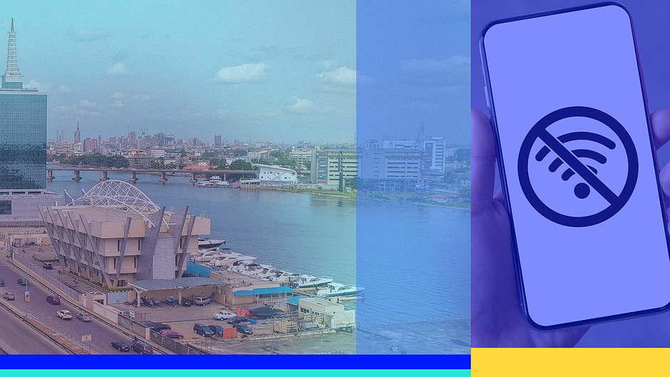
Advocacy Assembly Internet Shutdown Academy: Creative Strategies to Fight Back
Internet shutdowns are occurring increasingly globally, posing significant threats to freedom of expression, access to information & economic growth. These shutdowns manifest in various forms through different technical measures & are implemented by governments in various circumstances. Responding to this threat of internet shutdowns, Advocacy Assembly designed the Internet Shutdown Academy, a set of 10 full online courses in 7 languages!
Blog
Evaluating the Efficacy of State-Imposed Telecom Shutdowns in Northwest Nigeria
This article casts doubt on the shutdowns' effectiveness in curbing banditry, exposing alternative explanations for any temporary decrease in attacks. It questions the legitimacy of justifying these shutdowns as effective counter-terrorism measures, advocating for alternative approaches that prioritize community engagement, human rights, and development initiatives to address the root causes of insecurity and foster lasting peace in Northwestern Nigeria and Nigeria at large.
Blog
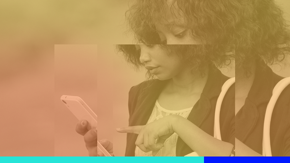
Impact of the Twitter Ban in Nigeria
This post is a research study on the impact of the Twitter ban in Nigeria on Human Rights Monitoring, Advocacy and Creativity. Read more.
Blog
Four Free Toolkits to Fight Internet Shutdowns
Let’s tell you a little bit more about each toolkit!
Blog
The Impact of Internet Disruptions on Farmers in Nigeria
In Nigeria’s Northwestern Sokoto State, farm workers grapple with geopolitical challenges, shifting climate realities, and economic turbulence. However, they now face a new, growing threat: a troubling rise in internet disruptions, which threatens their ability to work in an increasingly digitally connected world. Read more.