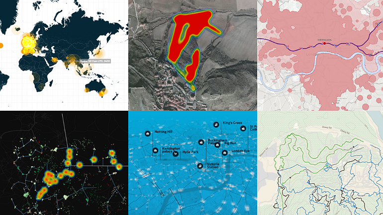
8 Free Dataviz Tools For Your Next Story
One of the best ways for journalists to tell more complex and engaging stories is to learn data gathering skills. From finding and cleaning data to filtering and analyzing it, journalists can uncover everything from political corruption to how family income predicts a child’s chance at attending university. Though many journalists rely on designers and developers to create compelling visual stories in newsrooms, sometimes the best option is to use free tools available online. To get you inspired, we’ve rounded up some of the best free tools for data visualizations on the web.
1. Tableau
With graphs, charts and maps on offer, Tableau Public is a free and popular data visualization tool. It lets users easily drag and drop data into the system and even updates in real-time. Tableau also lets you collaborate with other team members for quick project turnaround.
2. iCharts
The iCharts service provides a solution for creating and presenting compelling charts to include on your website. You can choose from a number of chart styles, and each is fully customizable to suit the color scheme of your site. What’s more, charts can pull data from Google Docs and Excel spreadsheets.
3. Timeline
Timeline is a free open source widget delivering a beautiful interactive timeline that responds to the user's mouse. The widget is ideal for revealing in-depth information without losing the big-picture view.
4. Raw
Raw allows users to create vector-based data visualizations where data can be safely uploaded from apps to computers, plus it can be exported as an SVG or PNG and easily embedded in your webpage.
5. InstantAtlas
If you're looking for a dataviz tool with mapping, you may want to try InstantAtlas. This tool enables you to combine statistics and map data to create engaging data visualizations.
6. CartoDB
CartoDB lets you visually analyze your location data in a way that makes sense for you. The tool provides an unparalleled way to combine maps and tabular data to create visualisations. For example, you can feed in a CSV or excel file of address strings and it will convert them to latitudes and longitudes and plot them on a map.
7. Infogr.am
Infogr.am is a free webapp that ingests spreadsheets and .csv files, and spits out gorgeous, interactive infographics. After you import your data, you can visualize it with standard bar, line, and pie charts, as well as a selection of customizable templates and interactive elements.
8. Google Charts
Google Charts lets people easily create a chart from some data and embed it in a web page. You can create line, bar, pie, and radar charts, as well as Venn diagrams, scatter plots, sparklines, maps, google-o-meters, and QR codes are supported.
Got a good dataviz tool that we missed? Tweet us the name at @advocassembly
Want to learn how to tell great stories with dataviz? Sign up to Advocacy Assembly’s free course “Data for change: Data visualization for human rights” taught by the award-winning designer Stef Posavec.
Related courses

90 mins
 School of Data
90 mins
School of Data Rory Peck Trust
50 mins
Rory Peck Trust
Blogs

6 useful resources for journalists covering Covid-19
With a global pandemic spreading throughout the world, journalists are under increasing pressure to report accurate and relevant news for the masses. Often when covering a crisis, those on the reporting frontlines compromise their physical safety and mental health. To show some solidarity, the Advocacy Assembly team curated a list of useful resources from other organisations leading the way on this.

5 ways to find data for your next story
Data journalism is fast becoming a big trend in newsrooms across the globe. However, data isn’t always so easy to find. Here are five ways to get data for your next article.