The role of typography in Arabic web design
Designing compelling experiences for the Arab user is a fascinating, yet a relatively unexplored, subject area. There is a huge under representation of Arabic content online, but it does not mean Arab users aren't there. In fact in most cases, they're using websites and apps in left-to-right (LTR) languages.
So what are some of the things you need to consider when designing for the Arab user? We recently interviewed Anna Rubkiewicz, the Editor at UXPA Magazine and a UX consultant for some insights on this topic.
Is there a need to design specifically for the Arab user?
It takes more to create an Arabic website than just translating the words and it's interesting to see that 60% of users (and a staggering 97% in Egypt and Saudi Arabia) declare, that they would be willing to use Arabic interfaces of apps or products, should they be available. This shows a huge market potential for designers who are aware of RTL (right-to-left) interface specificities.
What are some of the limitations of designing for the Arab user?
I wouldn't say there are many, because inhabitants of most Arab countries are as tech savvy as technology users elsewhere in the world. I'd rather say there are some fundamental differences (as mirroring the LTR layout) we should keep in mind when designing for the Arab user.
If I were to point to a specific limitation though, I believe it's the enormous disproportion between LTR and Arabic script typefaces. I know this may sound surprising, since everyone who's ever used Microsoft Word knows there's a decent list to chose from.
As noted by Typotheque though, Latin scripts such as Times New Roman or Arial were simply redesigned to resemble their left-to-right equivalents, and are an "anemic" version of Arabic typefaces, which are not all that comfortable for the Arab user to read..
What role does the language play in the design process?
Arabic, along with Urdu and Farsi, are languages that are written in an RTL (right-to-left) script. When an Arabic script user starts reading an article or filling out a form, he starts with the upper-right corner, unlike readers of Latin and Cyrillic script, who start from the top-left.
I would highly recommend looking at BBC and CNN in English, and then switching to Arabic/Farsi/Urdu. You will notice that the layout was mirrored, along with several icons, too (i.e. search bar). Due to the fact that Arabic (unlike, for example, English) has many shapes and diacritics, it is also very, very important to remember that, in most cases, font size used for Arabic should be bigger than that for Latin script websites. How much bigger it should be depends on the case, but usually it is about 3 point larger than the size that would be used for the LTR language. This, in turn, may require more space - hence, impacting design.
What are some unique things that are relevant only to the Arabic language that designers might overlook?
Apart from the above-mentioned specificity related to font size, I believe we should pay a lot of attention to cultural aspects. This is where designers, who studied or expressed interest in Islamic culture - and not only learned the basic technical RTL design skills - have a huge advantage.
While technical design guidelines are fairly well described (i.e. Google's Material Design Toolkit), it is quite difficult to find an online resource for designers that would tell them what they must absolutely avoid so they do not use controversial or offending content and symbols. I would advise anyone who decides to launch a product on the Middle Eastern market to read up on Arabic and Islamic culture, and be very careful when using elements or images that are perfectly effective for Latin script websites.
What are some initiatives that are working on designing fonts for RTL?
A great initiative, which deals, more specifically, with fonts among Arabic script countries, is a project by Wahibhaq, who noticed that Urdu readers struggle to read script in Naskhi font, which is prevalent in Arabic language countries, but not popular in Pakistan. Thus, he launched an open-source project with different versions of Nastaliq font - preferred by Pakistani readers.
Interested in more design tips check out our Design for Change- Data Visualisation for Human Rights Course.
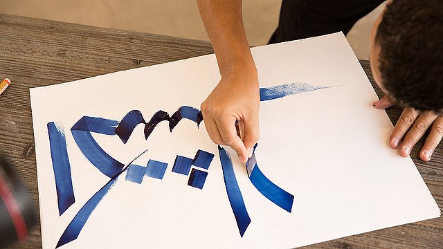
(Image courtesy MYLAND Calligraphy Project Under CC BY 2.0. Original image https://www.flickr.com/photos/landrovermena/15183073013)
Related courses
90 mins
 School of Data
90 mins
School of Data Rory Peck Trust
50 mins
Rory Peck Trust
Blogs

6 useful resources for journalists covering Covid-19
With a global pandemic spreading throughout the world, journalists are under increasing pressure to report accurate and relevant news for the masses. Often when covering a crisis, those on the reporting frontlines compromise their physical safety and mental health. To show some solidarity, the Advocacy Assembly team curated a list of useful resources from other organisations leading the way on this.
5 ways to find data for your next story
Data journalism is fast becoming a big trend in newsrooms across the globe. However, data isn’t always so easy to find. Here are five ways to get data for your next article.