
Visualizing The Five Ws and How: How to grab audience attention in the data age
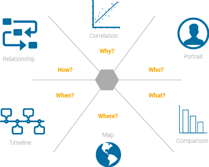
Every good story has its own formula. But no matter what the topic is, you have to collect and reveal certain information by answering the six famous 5W1H questions: Who, What, Why, When, Where and How.
To address these questions, we can draw on the lessons of another famous saying. The term "a picture is worth 1000 words" is a proverb that you have probably heard more than once, and it also summarizes the importance of data visualization. Telling stories visually is a great way to help broader audiences understand the 5W1H questions and digest complicated data.
By using a visualization to quickly draw attention to the key information, it's also possible to uncover surprising patterns and observations that wouldn't be apparent from looking at the facts alone.
And, as we are living in the age of visualization where images become the headline, it is important to showcase the 5W1H and display the story’s key facts in a powerful way.
Who
The answer is usually a person or a group so creating a profile is the best way to present this answer. For example, making a profile of a celebrity, or a film crew or even of an historical persons. Most popular designs are based on the photo of this person surrounded by numbers and drawings, for an example we can find a lot of infographics about bill gates, messi, Obama and also you can find a lot of examples about role models people.
Do during this kind of visual stories you can know a lot of information, data, and facts about that person in no minutes.
What
This question always answers, reveals detailed explanations, which can be shown in charts such as comparing two variables through line or column chart.
The line chart displays information as a series of data points called 'markers' connected by straight line segments. It is a basic type of chart common in many fields which shows the data trends, and how it changes through the time.
Column charts are used to compare values across categories by using vertical bars. This kind of charts is suitable for visualizing the quantitative data.
Pie charts, line and bar charts are useful in explaining data and presenting very clear answers for the ”what” question. Because it displays the data in more than one context such as the comparisons, trends, timeline, and showing the percentage and the conclusions, besides those different relations between the data reveals “what’s behind the numbers.
Where
Whenever we talk about a place, a map is usually the first image that jumps into our minds. Maps can be used to visualize basic information in a revealing new lights, also they are useful tools to structure analysis, that shows the details of the locations which can lead us to new stories. Sometimes, a location by itself can be the whole story and nothing can be helpful in the design as a map. For example, we can display the top ten countries to live in just by using a map.
One of the most famous maps examples is Dr. john snow, and that was the beginning of the data visualization in the cholera age, so from the drawing of this map he reached the real reason behind the raising the death numbers.
When
Time is the measure of all things in life and a basic stone in building the story. For example, when talking about the coming election and its procedures, or talking about the achievements of a president, time is a crucial component to address.The best choice to visualize ”when” is the timeline, which allows the reader to see, follow and understand events through a straight line of time. The reader is able to interpret a series of events in chronological order, sometimes described as a project artifact. It is usually a graphic design showing a long bar labelled with dates alongside itself, while events can be labelled with points. For example in visualising timelines, Arab spring revolutions which started in 2011 in Tunisia, Egypt, Libya and Syria are still going on.
Why
Answering ”why” generally requires a visual to deal with more components, using data analysis to reveal the correlation between them. There are plenty of charts that can help illustrate the “why” effectively. One example is the bubble chart, which displays dimensions of data. Bubble charts are used to visualize a data set with two to four dimensions.
How
This question reflects the steps or the phases involved in a story, which can be presented through a flowchart. This kind of chart shows the steps as boxes of various kinds, and their order by connecting them with arrows. This diagrammatic representation illustrates a solution model to a given problem. for an example why the flowchart is useful, if we want to visualize data about the Jihadi groups structures, Qaeda, or ISIL the flowcharts will be the suitable choice for displaying it. Flowcharts are used in analyzing, designing, documenting or managing a process or program in various fields.
This blog was written by Amr Eleraqi. Amr is an Egyptian journalist with more than 10 years of data journalism experience. In 2012 he founded InfoTimes, the first infographic website in the Middle East. You can enrol for his new course 'Visualise your Data with the best charts and graphs' here.
(blog image courtesy Emergency Dentists USA)
Related courses

90 mins
 School of Data
90 mins
School of Data Rory Peck Trust
50 mins
Rory Peck Trust
Blogs

6 useful resources for journalists covering Covid-19
With a global pandemic spreading throughout the world, journalists are under increasing pressure to report accurate and relevant news for the masses. Often when covering a crisis, those on the reporting frontlines compromise their physical safety and mental health. To show some solidarity, the Advocacy Assembly team curated a list of useful resources from other organisations leading the way on this.

5 ways to find data for your next story
Data journalism is fast becoming a big trend in newsrooms across the globe. However, data isn’t always so easy to find. Here are five ways to get data for your next article.